¶ Overview
Forms serve as a streamlined and efficient initial step in a workflow, enabling the creation of a job with all necessary information and the ability to upload files seamlessly.
This versatile tool empowers users to easily design forms tailored to their specific needs. With a drag-and-drop interface, components can be effortlessly added and repositioned, allowing for the creation of a customized form that aligns perfectly with your workflow requirements.
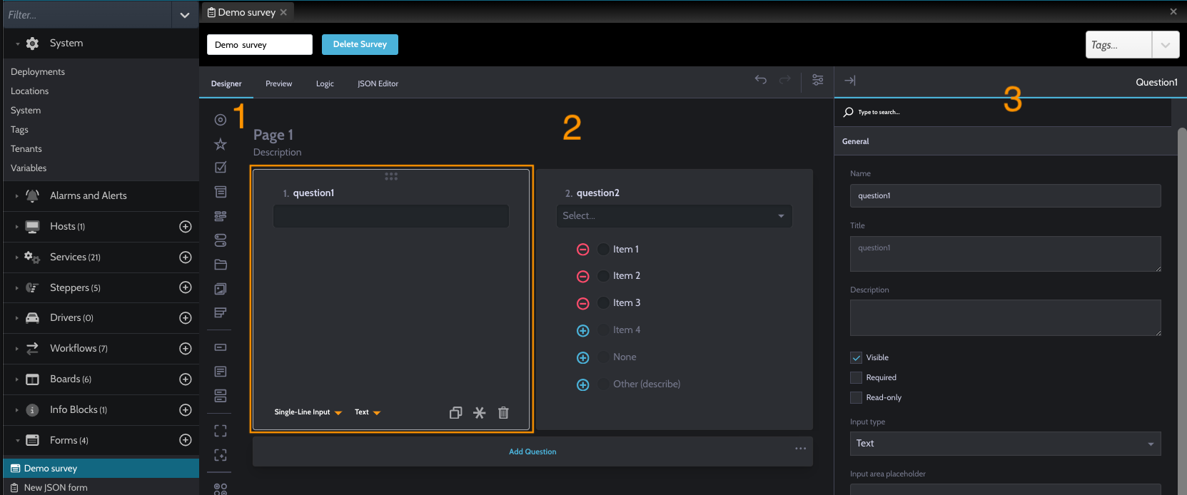
Key Components of the Form:
- Side bar list of components
- Main page used to reallocate the components
- Component edit section
The form creation process is designed to enhance flexibility and efficiency, providing users with a powerful tool to streamline workflow initiation and information gathering.
¶ Form
¶ Components
The form boasts a variety of components, including but not limited to:
- Radio Button
- Single Inpunt
- Checkboxes
- Dropdown
- Multi-Select Dropdown
- Yes / No (boolean)
- File Upload
- Muti-Select Matrix
¶ Editing Component
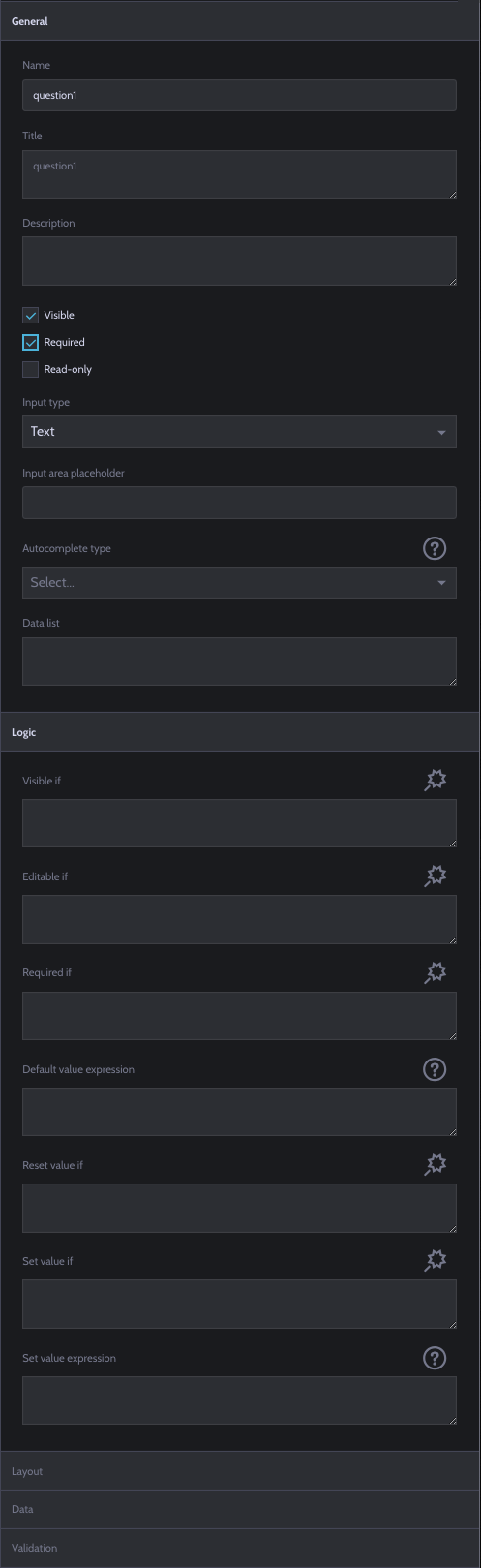
Each component is editable, offering flexibility in customization. Select a component, and use the right-side panel to modify its name, title, and description. For example, an input component allows adjustments such as visibility, read-only status, and requirement settings. Choose the input type (Date, Number, Text, etc.) and modify the layout and data properties.
Components also feature a quick logic section, allowing you to set visibility when specific conditions are met. Utilize the wand button to easily set conditions, or input custom conditions manually.
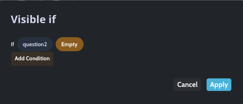
For example here you have question 1 that will be visible only if question 2 is empty.
¶ Form top Bar
The top bar of the form provides a toolbar with four options:
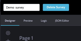
- Designer: Modify and change the form layout
- Preview: View a preview of the form
- Logic: Access detailed logic for further customization.
- JSON Editor Edit the form using a JSON object, providing an alternative configuration method.
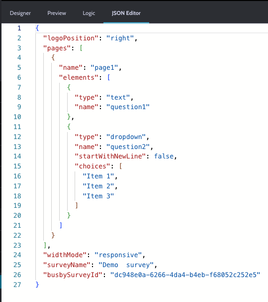
¶ JSON Editor
For advanced users, the JSON Editor offers an alternative method for configuring the form, providing a more granular approach.